risograph
The Risograph has always been in my mind because of the bold and neon inks, the offset and the overlapping of colours made it even more fascinating. When I finally have the opportunity to work with it I am very excited.
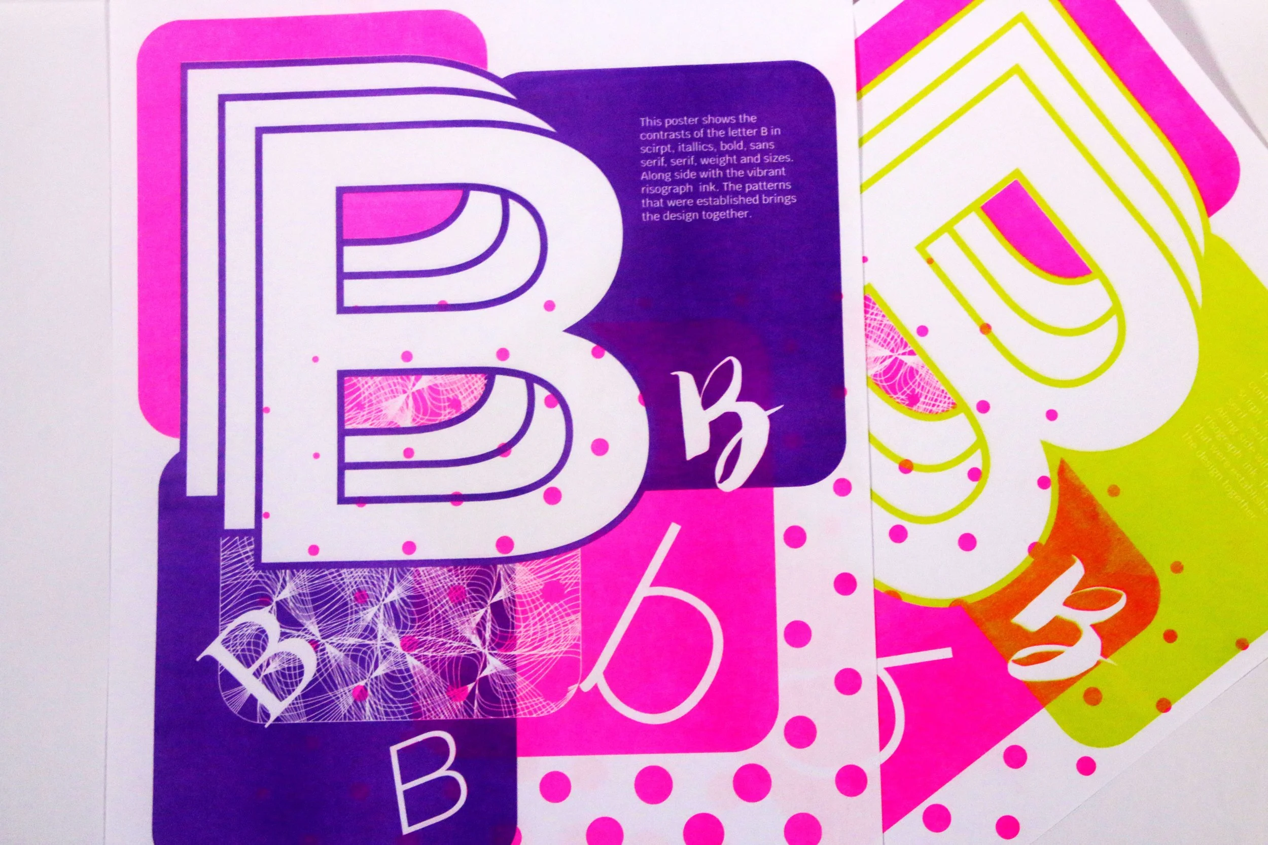
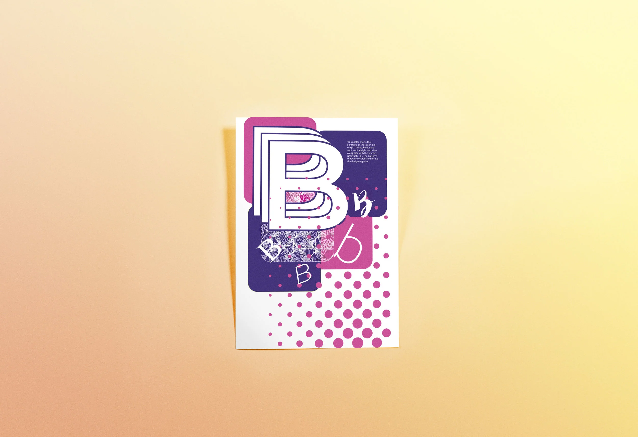
This poster is meant to show contrasts within the letter B itself, with different stance, forms, sizes, weight and more. I figured out colour blocks and half tone patterns would work well for this particular printing method and decided to give it a go.
The printing went well with the poster I designed, although the lines of the pattern was a bit too thin to align perfectly, the other overlapping parts turned out as expected. I originally planned to use blue and pink for the poster but the blue ink drum ran out, so then I printed the poster in both lime green and purple with pink. I liked how it have turned out to be, but the type on the green did not show up well. I then tried purple , since it is more similar to blue and with the much darker background the white text showed up better.